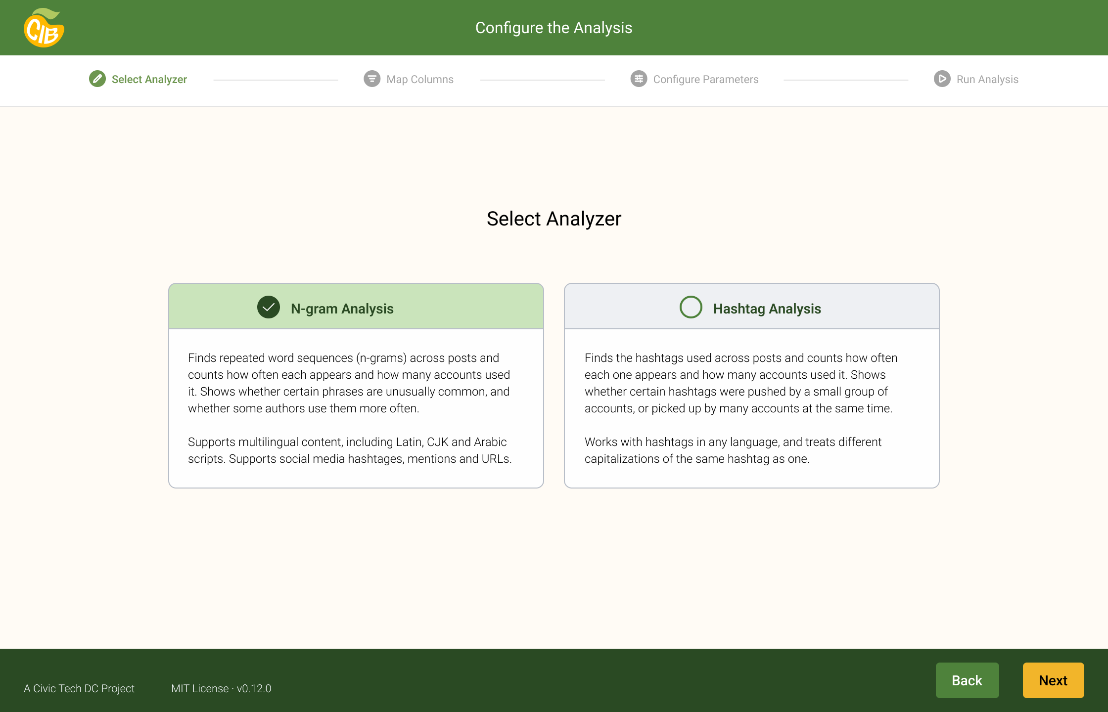
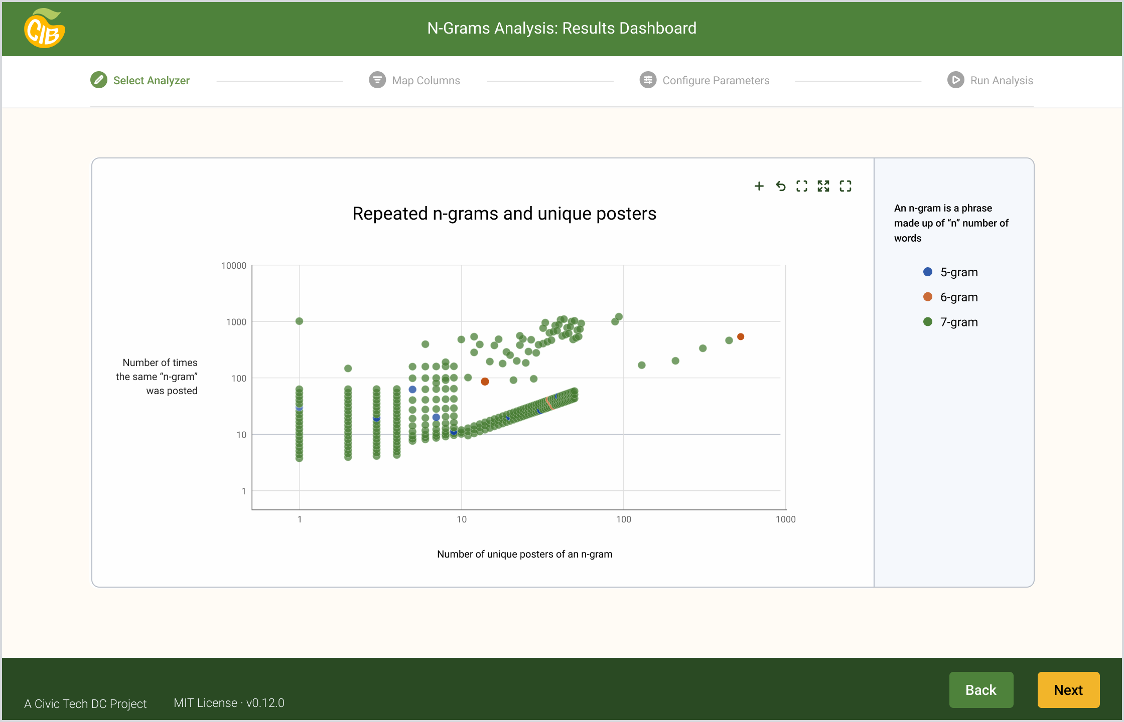
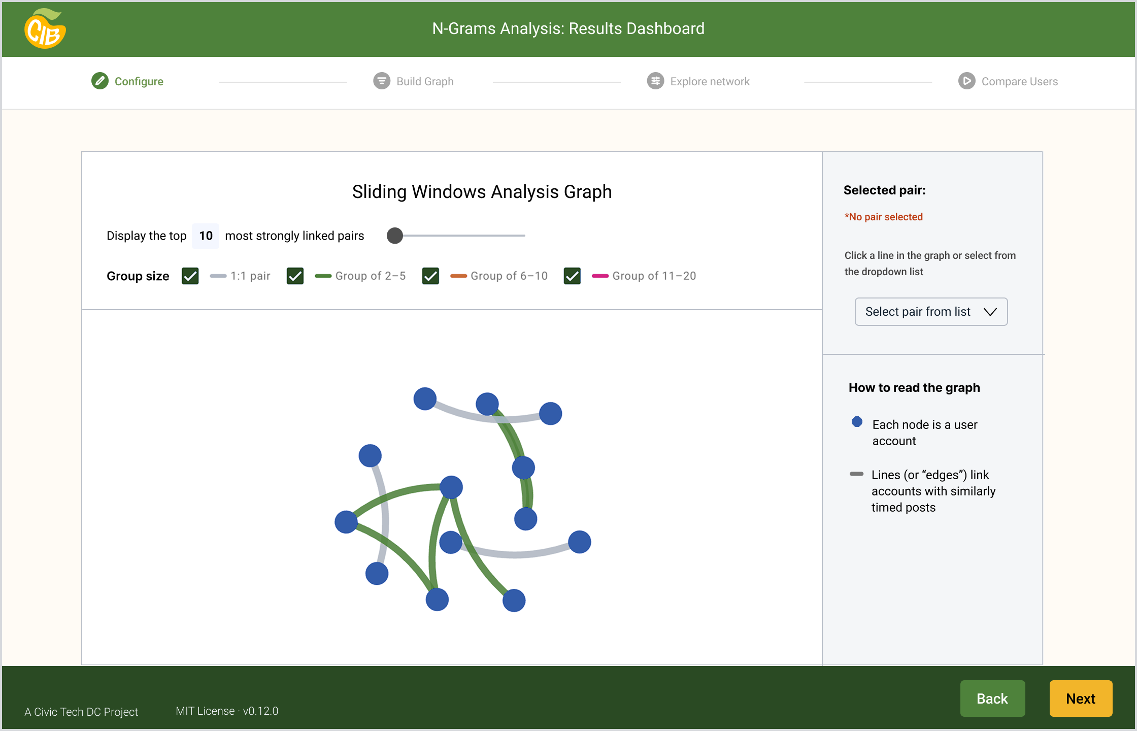
Civic Tech DC:
CIB Mango Tree Tool
Role: Lead Brand and UI Designer
Problem: CIB Mango Tree’s visual identity and interface have evolved organically, without a cohesive set of brand or UI standards. As the team prepares to share the tool with researchers, journalists and other potential users, a design system is essential for a consistent, credible experience the team can build on.
Impact: An approved, accessible color palette, a token system shared between Figma and code, and a component library and screen template the team can build from. The redesigned screens give usability testing a polished starting point, and future changes can be made once and applied everywhere.
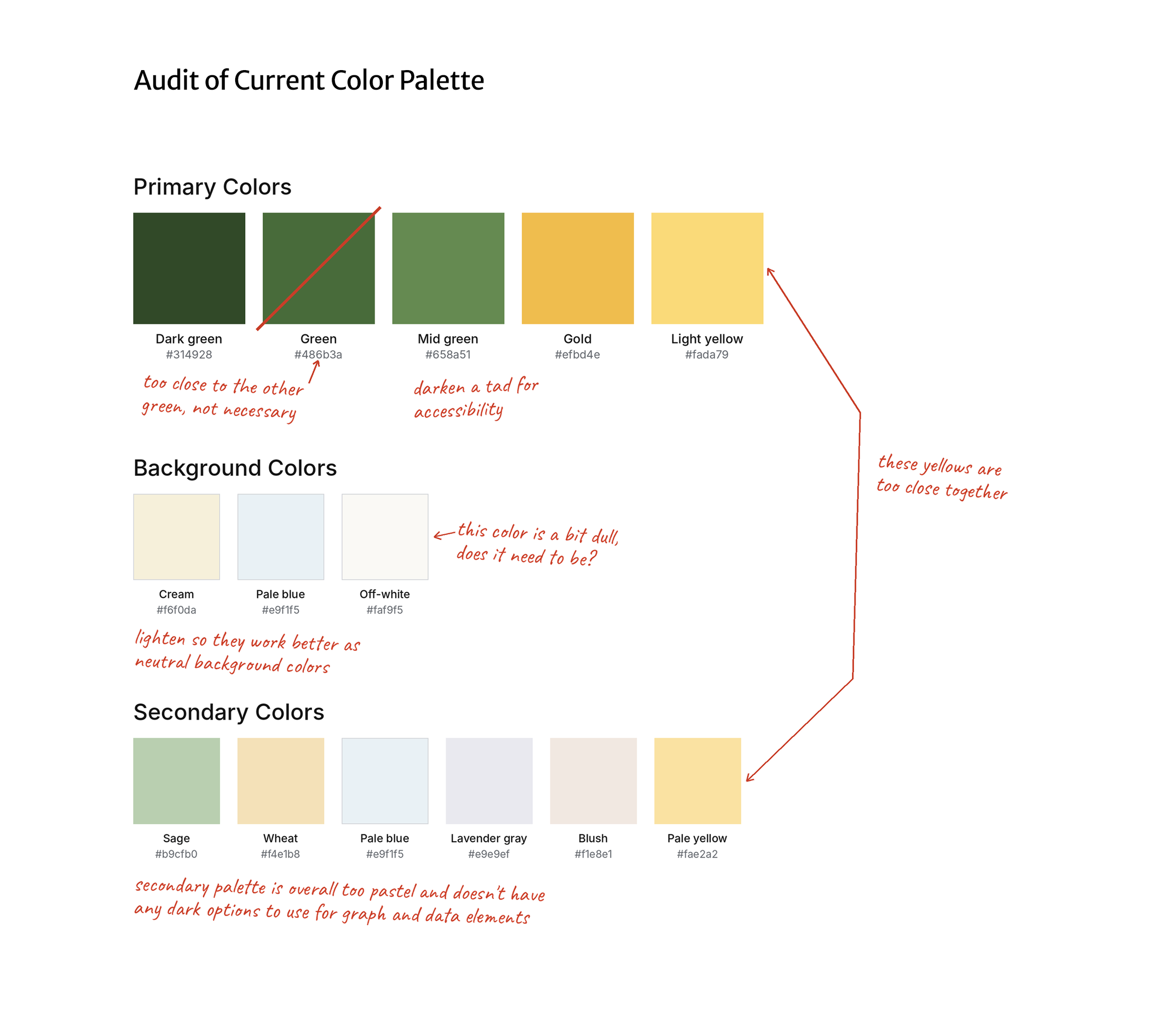
Color Palette Refinement
To keep the project moving and focus our effort on the design system, we chose to refine the existing palette rather than replace it. I audited the colors already in use on the website, then refined them to account for:
Accessibility standards
Brand values, including “civic integrity” and “transparency”
UI surface needs
Data visualization needs
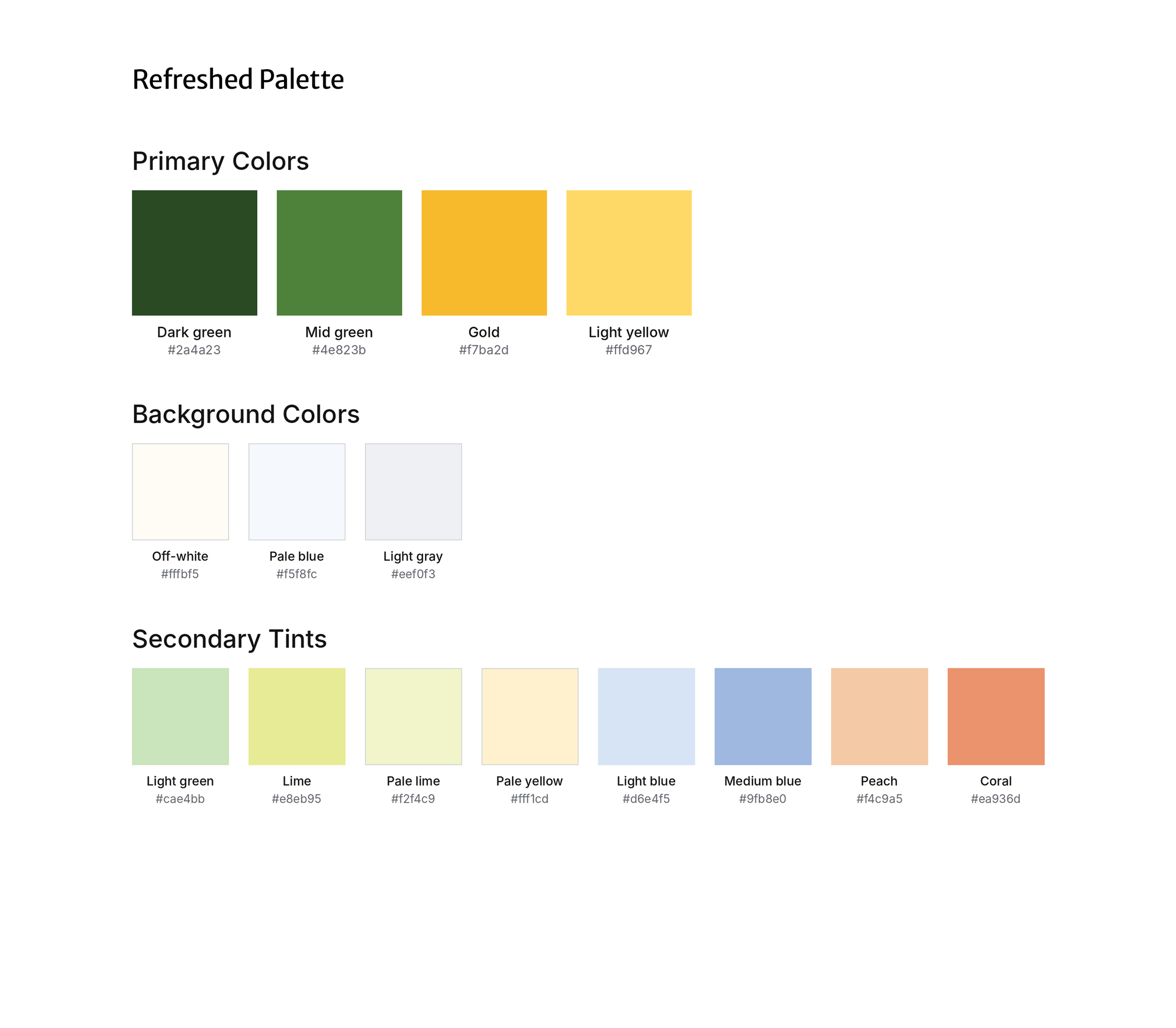
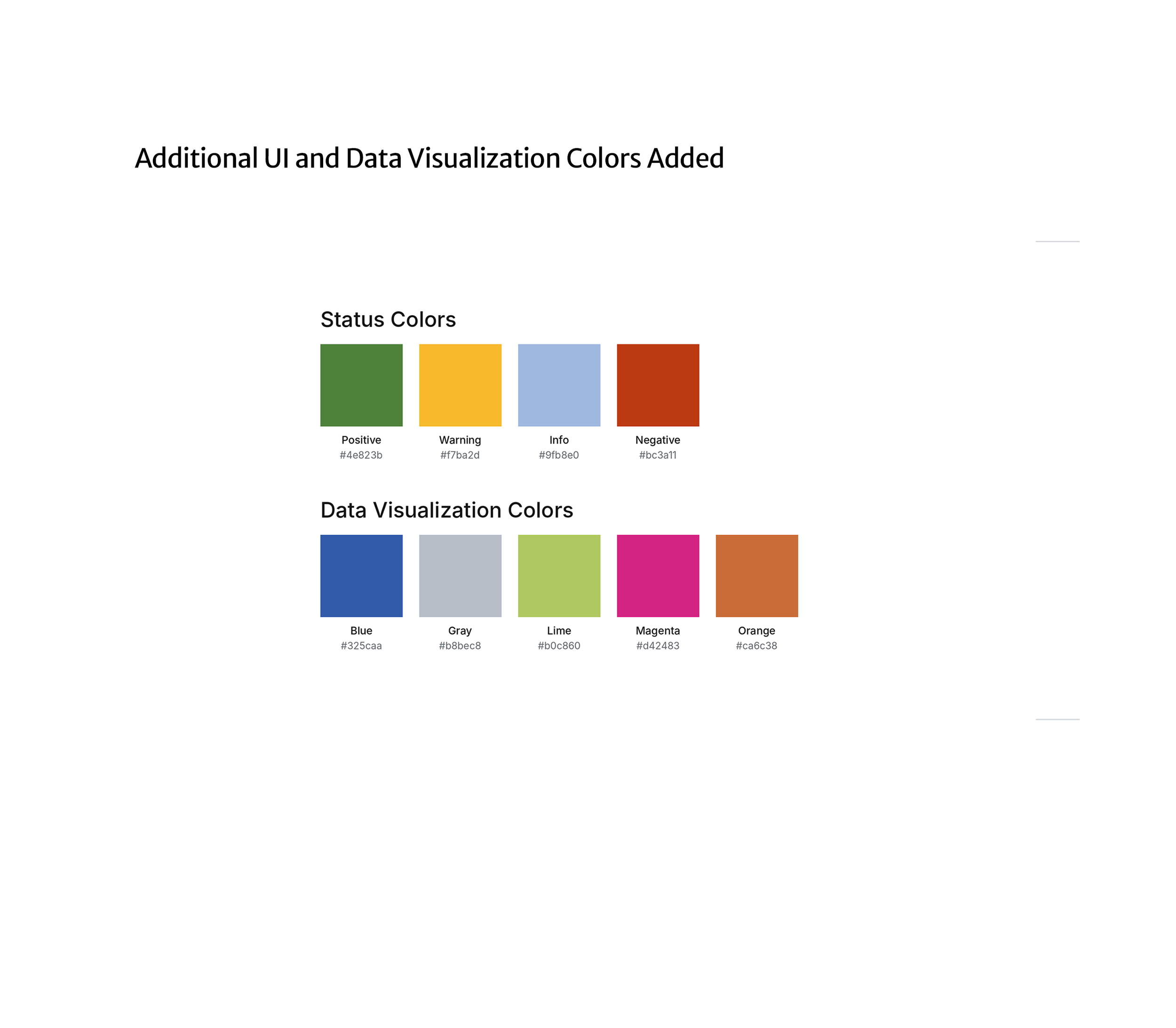
Homepage color scheme “before and after”
Before
After
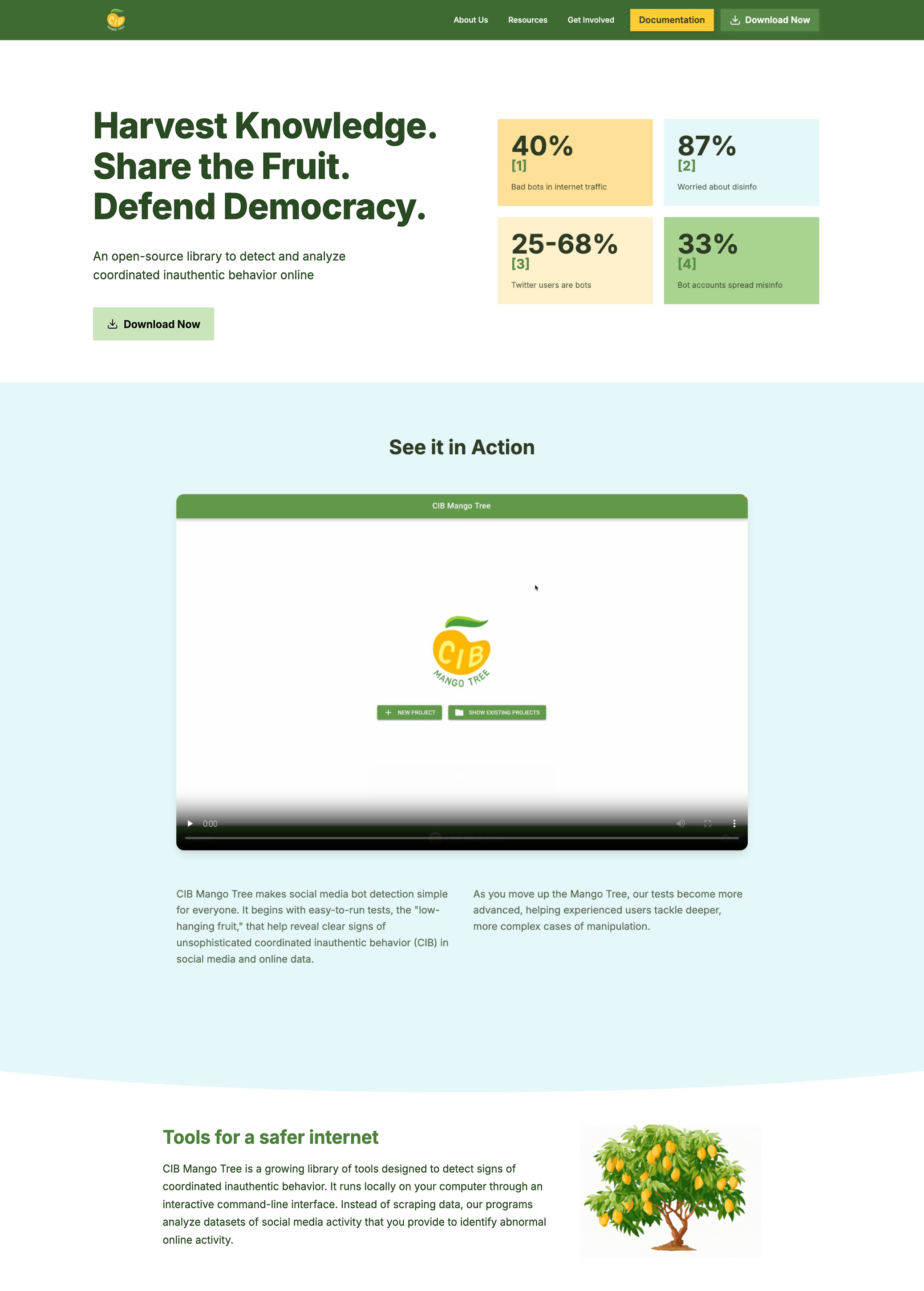
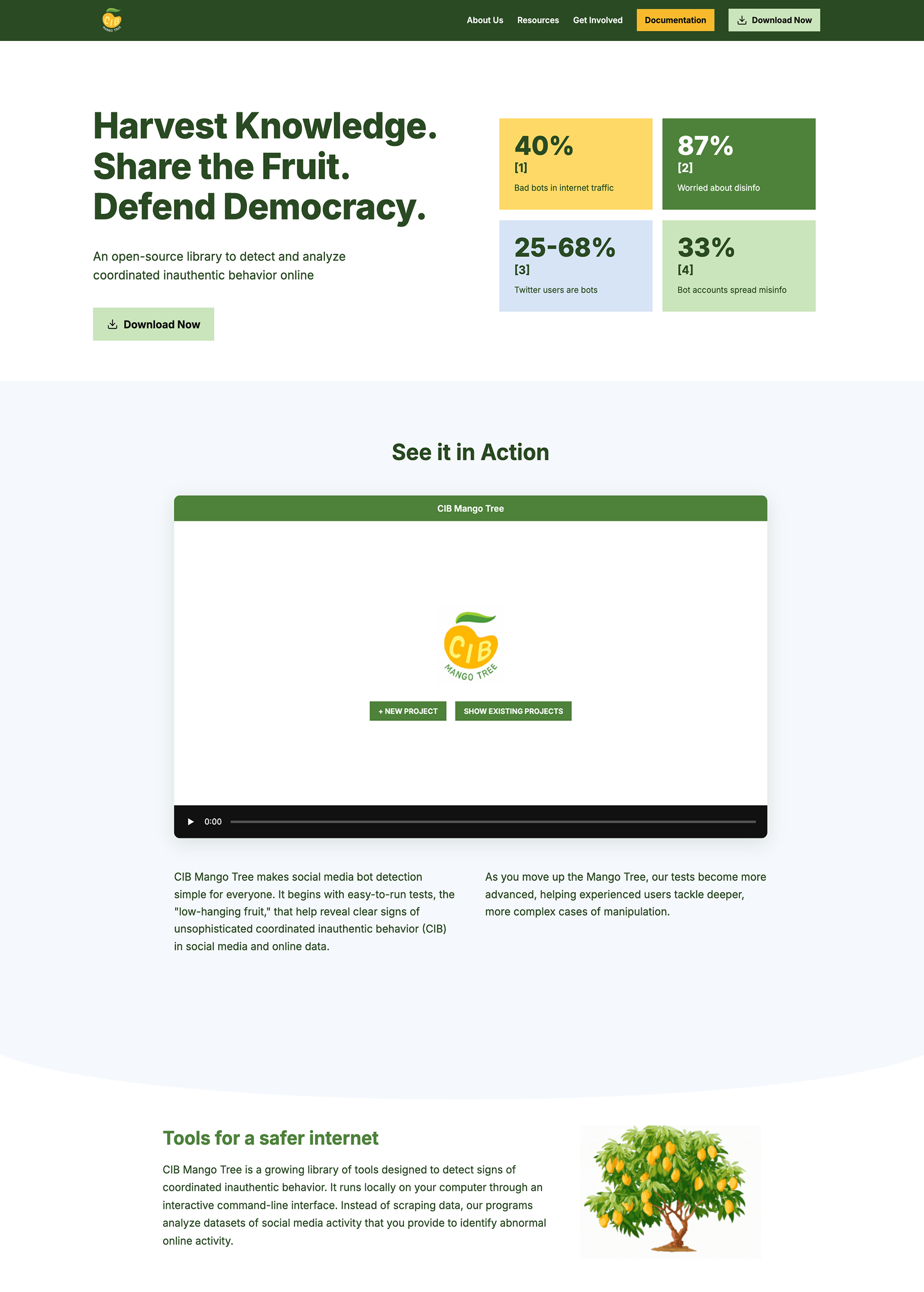
Figma Tokens
I built a two-layer token system in Figma, with primitives hidden so designers only use semantic tokens named by purpose. I matched the token names to the color slots in the tool’s code and worked with the developer on a shared token sheet mapping each one to the Python theme, so a color change happens in one place. I used Claude to speed up the setup, then reviewed and refined the system myself.
| Name | Value |
|---|---|
| brand | |
primary | green/mid |
secondary | green/dark |
accent | gold/base |
dark | green/dark |
| status | |
negative | red/base |
positive | green/mid |
warning | gold/base |
info | tint/medium-blue |
| surface | |
highlight | yellow/light |
panel | neutral/off-white |
sidebar | neutral/pale-blue |
button-secondary | neutral/gray-light |
button-secondary-on-dark | tint/light-green |
| surface / tint | |
light-green | tint/light-green |
lime | tint/lime |
pale-lime | tint/pale-lime |
light-blue | tint/light-blue |
medium-blue | tint/medium-blue |
pale-yellow | tint/pale-yellow |
peach | tint/peach |
coral | tint/coral |
| text | |
default | neutral/black |
heading | green/dark |
heading-mid | green/mid |
heading-on-dark | neutral/white |
heading-on-dark-gold | gold/base |
heading-on-dark-yellow | yellow/light |
heading-on-dark-pale-yellow | tint/pale-yellow |
heading-on-dark-light-green | tint/light-green |
on-dark | neutral/white |
| chart | |
color-1 | dataviz/blue |
color-2 | dataviz/magenta |
color-3 | dataviz/orange |
color-4 | dataviz/lime |
color-5 | dataviz/light-gray |
| border | |
divider | dataviz/light-gray |
| state | |
hover-overlay | 00000015% |
hover-overlay-green | green/dark-1515% |
Figma Components
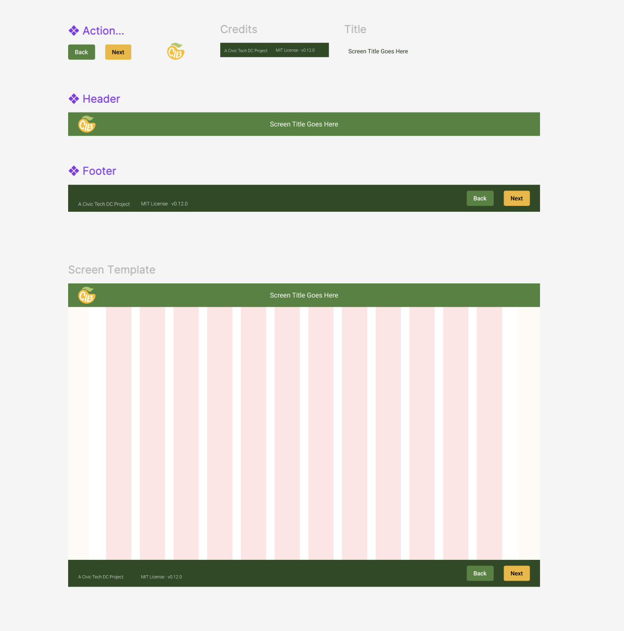
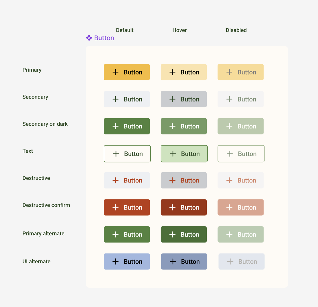
I build reusable Figma components that combine into a screen template on a 12-column grid with a fixed content width. For the team, this means new screens can be built quickly from parts already in the library, the developer can work from consistent patterns instead of one-off designs, and changes after usability testing can now be made once and carried through every screen.
Applying the System