Various Logos
Muslims of Millburn and Short Hills
Muslims of Millburn and Short Hills is an organization focused on strengthening the local Muslim community through events and outreach. The logo incorporates the organization’s acronym into a custom Arabic-inspired script, creating a meaningful graphic rooted in Islamic tradition. Built on a grid, the mark is paired with a typeface that references Islamic architectural arches while subtly echoing the Tudor style found in the surrounding towns.
Druid Heights CDC
I worked with the Neighborhood Design Center in collaboration with a team of designers to create a logo that would represent the Druid Heights Community Development Center in Baltimore and the Druid Heights neighbrhood as a whole. The community chose my logo design as they felt that it best represented their vision for the future of the neighborhood. I used a black line connecting the homes and the trees to represent the strong bond between community members.
Read more about the process
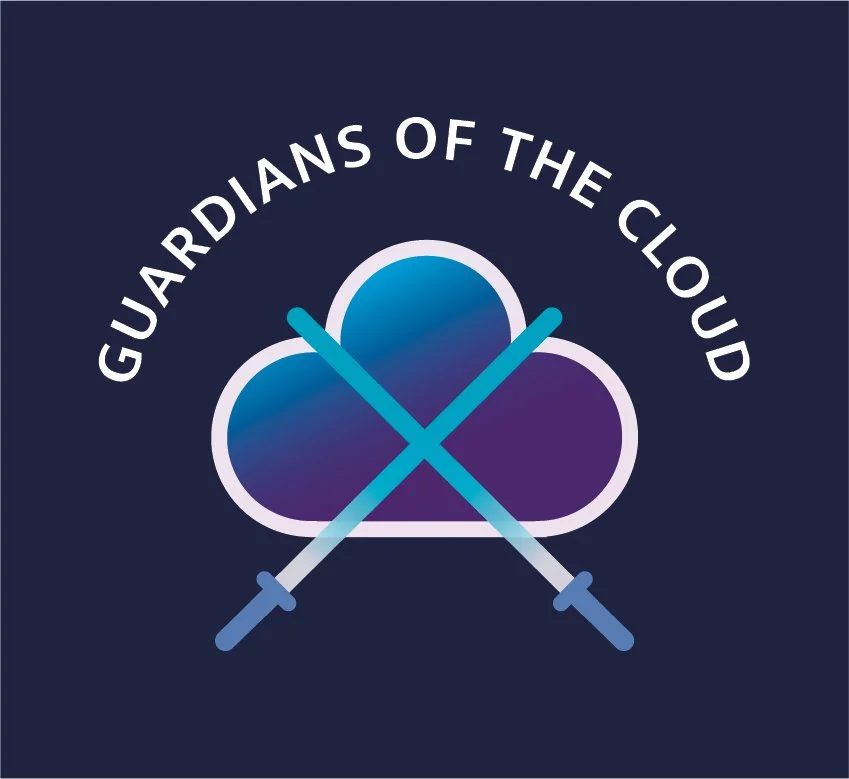
Guardians of the Cloud
Guardians of the Cloud is a learning experience designed to build confidence and fluency in cloud security. The logo draws inspiration from sci-fi storytelling—using crossed, lightsaber-like blades as a symbol of protection and readiness.

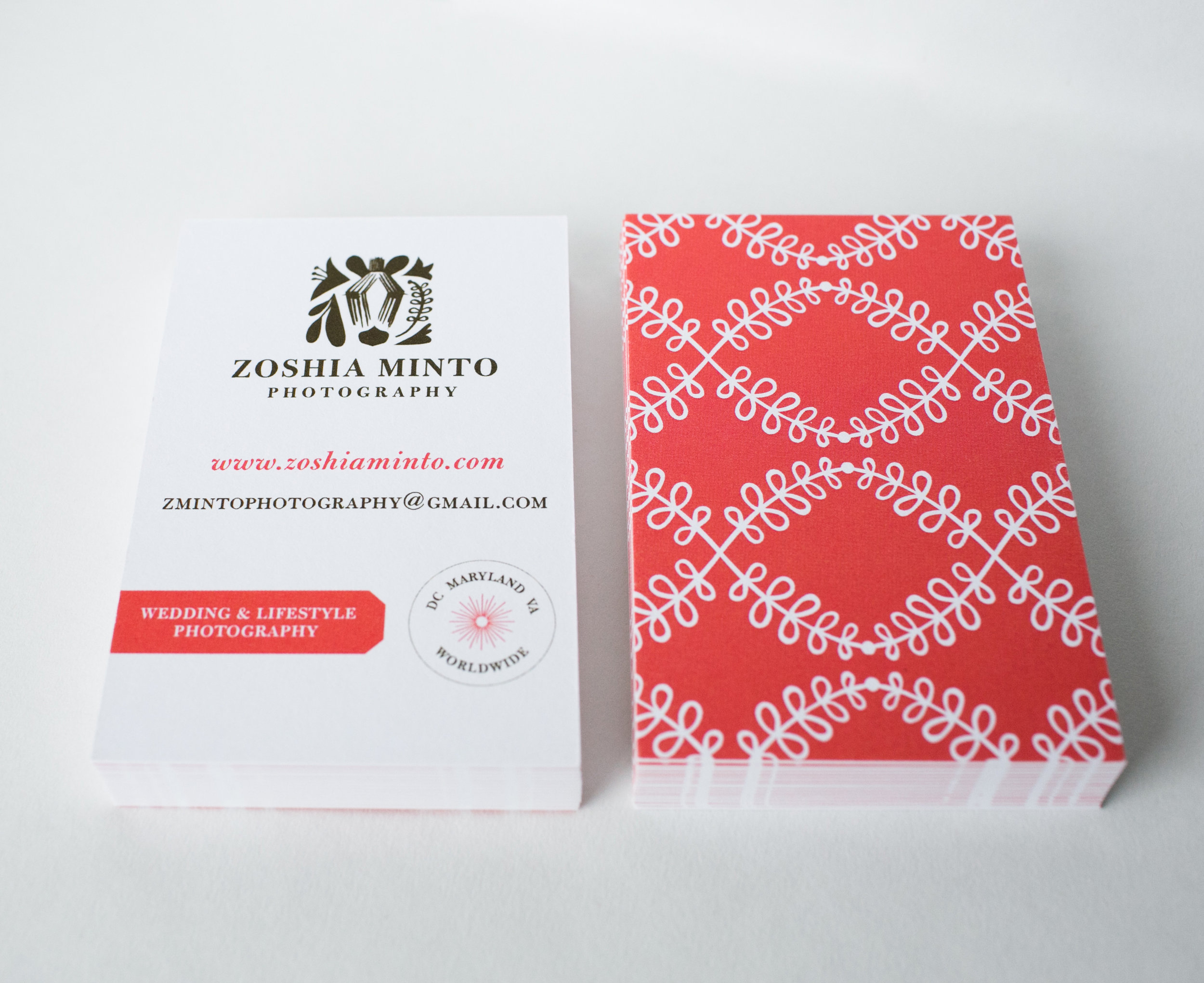
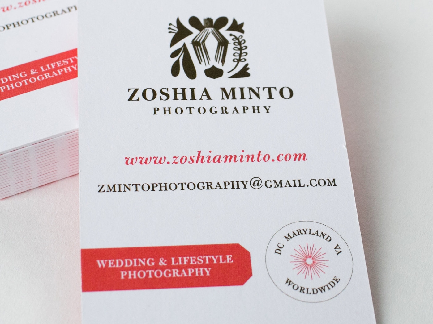
Zoshia Minto Photography
This logo was designed for photographer Zoshia Minto, who wanted an identity that would resonate with wedding clients while still feeling personal. The concept incorporates a zebra—a reference to her childhood in Kenya—rendered in a subtle, abstract form. The mark began as a series of hand-drawn explorations, allowing the imagery to emerge organically, before being refined and translated into a final digital logo.

QuranSeeker.com
The client wanted a logo that clearly represented a web-based program teaching Quranic Arabic. The final design uses a classic typeface to reflect the timeless nature of the subject matter. A subtle graphic of a man raising his hands in Islamic prayer—cleverly forming the letter “k”—adds meaning and memorability to the logo.

Run for Skip
I designed this logo for the annual Run for Skip charity event held by Rydex Investments. Run for Skip was started in the name of Rydex Investments' late founder, Skip Viragh, and benefited research on pancreatic cancer. The logo incorporates Skip Viragh's initials—a sideways letter "S" and an upside down "V".

Information Systems, UMBC
I created a brand identity for the Information Systems Department at the University of Maryland, Baltimore County. The arrows represent the exchange of information and data, which are important parts of Information Systems. The logo also contains the shape of an "i" and an "S".

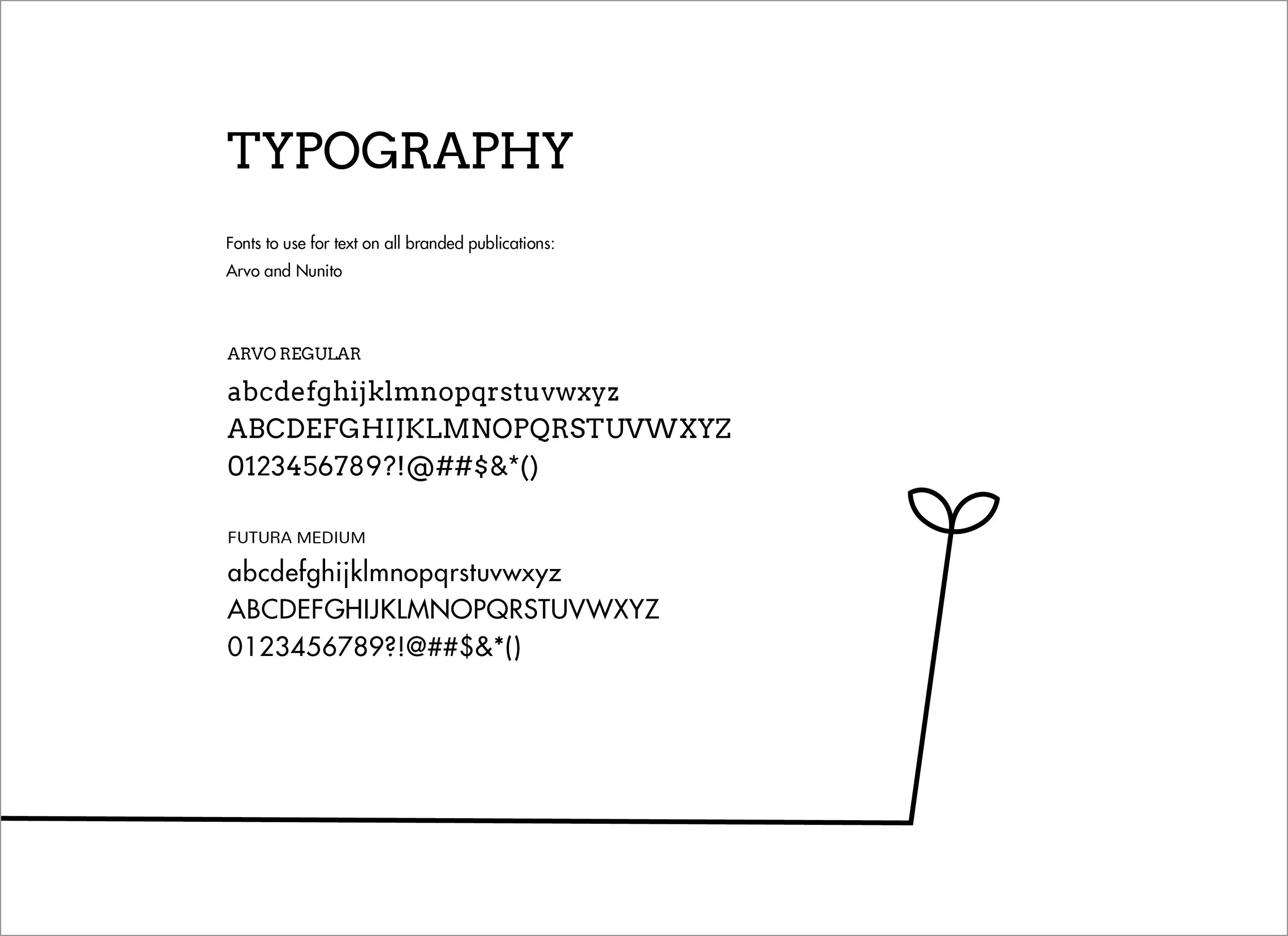
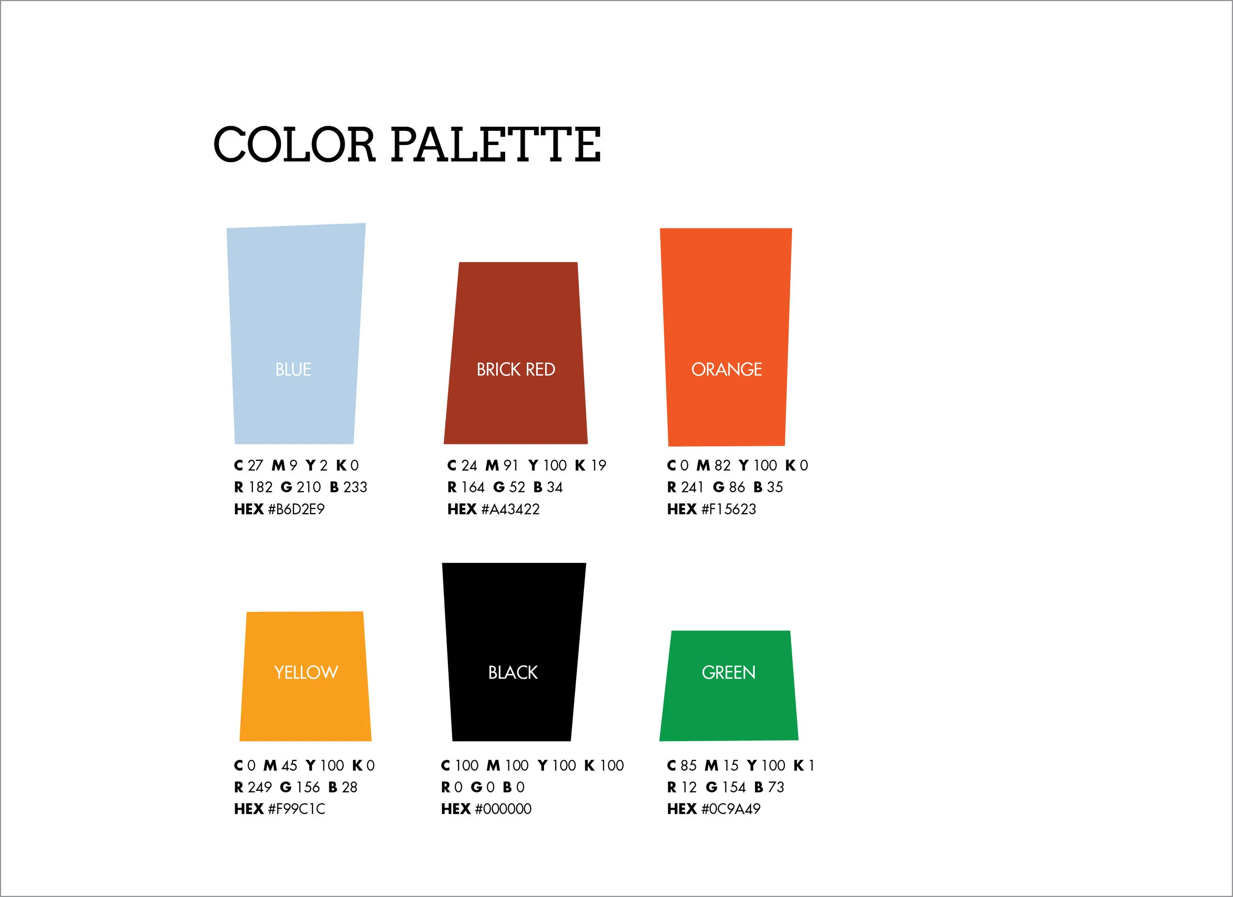
The identity manual for the Information Systems Department at UMBC.